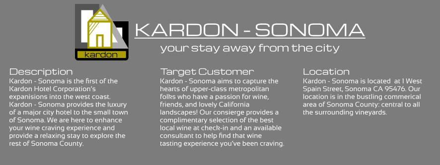
Kardon - Sonoma: A Hotel Experience
Problem Statement
This is a class project for ITP 310: Design for User Experience.
"Kardon - Sonoma" is a UX Design for a hotel mobile application. My professor gave me the opportunity to design a mobile app
in Figma for an existing or non-existent hotel.
Project Deliverables
- Devise an identity for a hotel
- Create a logline or slogan
- Determine the target customer
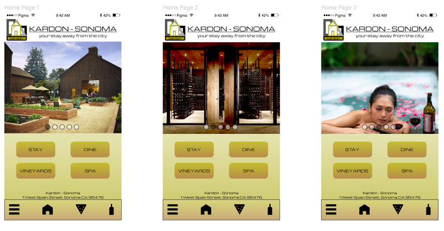
- Develop a Home Page, Hamburger Menu, and Login Page
- Build a working prototype in Figma
Tools:
- User Research: Quora, Google Forms.
- Prototyping: Figma.

User Research Process
The first step to producing the aforementioned deliverables was conducting user interviews:
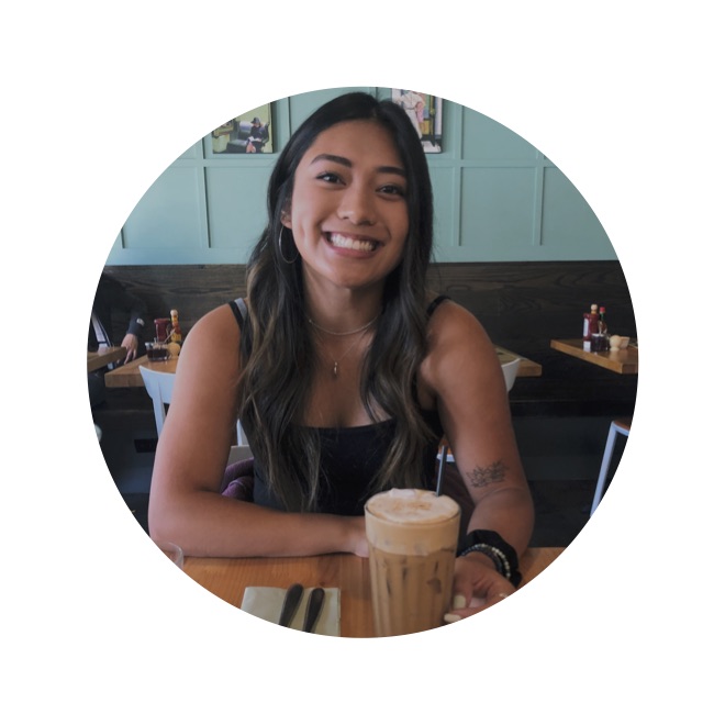
Lois
Lois is a student at the University of Washington, Seattle. She and her family are avid wine enthusiasts.
They live in a densely populated area in San Francisco. They love going wine tasting in Sonoma
(just a 2-hour drive), but their visits are always limited to day trips.
- "I'm not the biggest wine drinker, but I love to join my family and spend quality time with them."
- "We only stay for a couple of hours and then leave. I wish I could explore Sonoma more because it's really beautiful and peaceful."

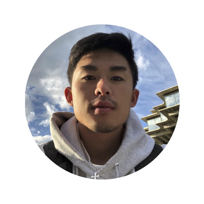
Henry
Henry is a graduate student at the University of San Francisco. He and his friends go to
Sonoma two or three times a semester. His favorite part of the trip is spending quality time
with his friends. He doesn't think of Sonoma as an overnight destination, but he believes he
and his friends would get more out of their trips if they could extend the trip overnight.
- "I love going to Sonoma. I've always had a great experience with friends."
- "The hotels in the area are not very updated or modern. None have even caught my attention or made me think to stay overnight."
Arthur
Arthur is a master's student at the University of California, San Francisco. Arthur does
not have much time to go out with his busy schedule as a medical student. He's looking
for an opportunity to do a short trip with the few weekends he has available. He's heard
of Sonoma and the vineyards from his friends but is looking for more than just a wine trip.
- "Being a UCSF student is really demanding, so I don't have much time to do weekend trips."
- "I'm currently on the hunt for a quick trip nearby. Sonoma sounds nice, but what else is there to do besides wine tasting?"
Research Results
As a result from the interviews, it seems like there's interest in a modern style hotel with an established name. Sonoma is a great location since it's a mini-vacation of sorts with a lot of character and notoriety. Lois & Henry are interested in extending their trips to spend more quality time with their loved ones. Arthur is interested in the idea of a quick trip, and Sonoma's proximity entices him. However, he wants more than just a wine trip so the hotel should include something for all audiences. Henry didn't seem to even think of Sonoma as an overnight destination, so an established hotel brand could validate Sonoma as a weekend trip destination rather than just a day trip destination.
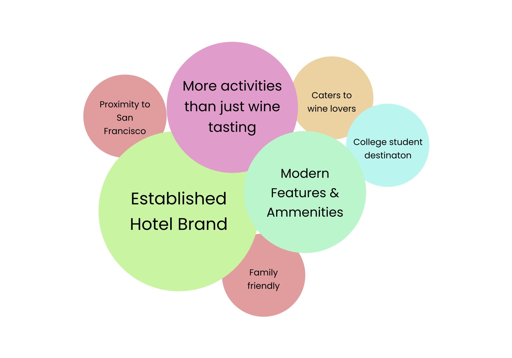
The user interviews also help us define the identity of the hotel, the target customer, and location:
Wireframing Process
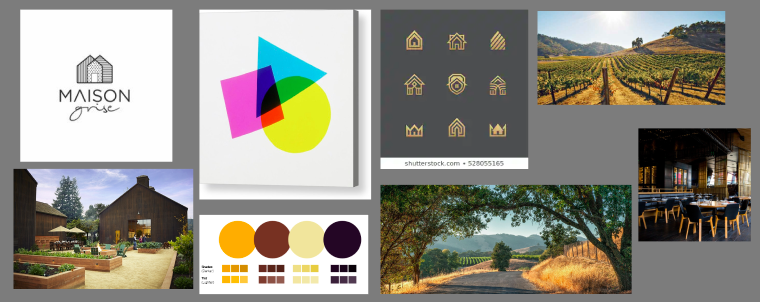
First, I created a mood board to elicit the identity and feel of the application.
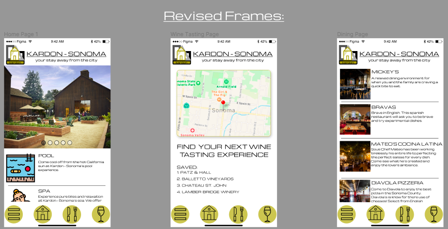
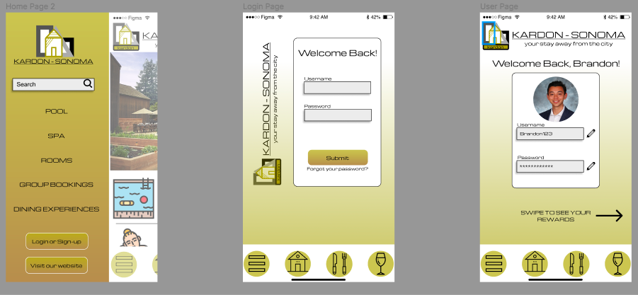
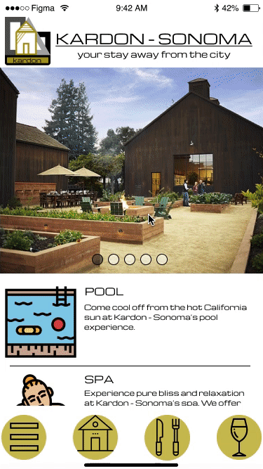
Second, I built out a few draft frames.
Critiques from classmates & professors...
- "Fix navigation bar, its look homemade."
- "Add a profile page."
- "Include pictures of real places."
- "The font makes the app seem high-end."
- "The logo looks nice!"
- "Fix the buttons, the icons look homemade and not high-end like the rest of the application."
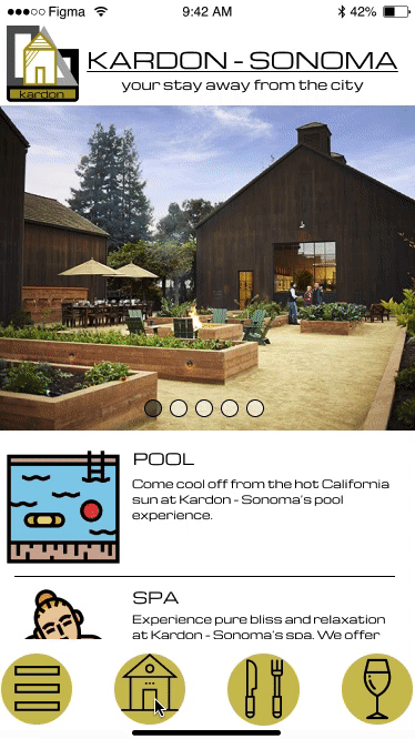
Prototypes and Final Frames
I took all the critiques and implemented them into the final product. I also utilized Figma's prototyping to create functional designs.
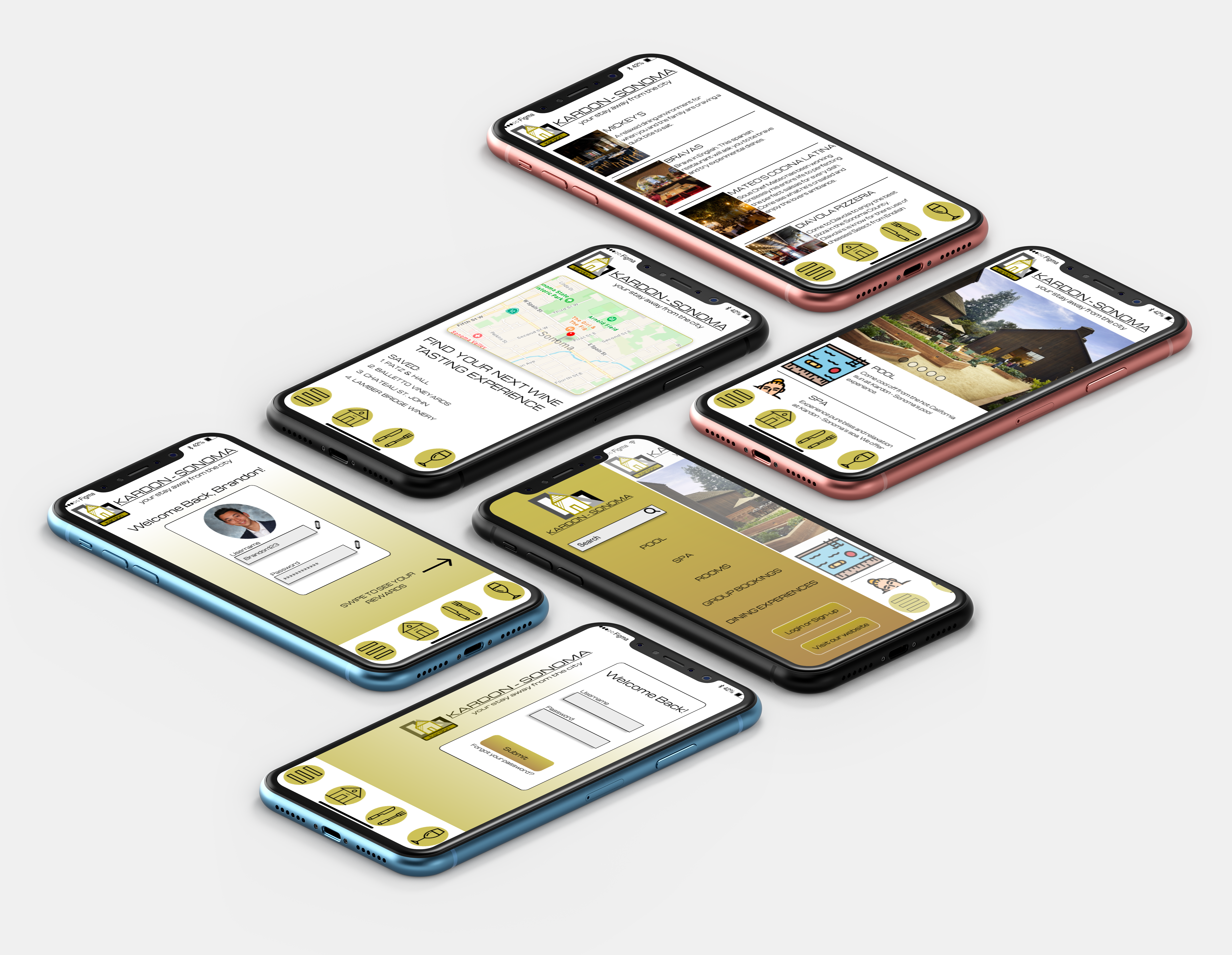
Features
- Sign Up / Log In
- Hotel Rewards
- Amenities Browsing: pool, spa, dining
- Dining Experience Previews
- Wine Tasting Map & Booking
- Room Bookings
Dynamic Walkthrough
Reflection
Users download hotel mobile applications for a variety of reasons. They could be browsing their amenities, booking a room, or trying to earn rewards. I didn't really get a chance to figure that out over the course of this assignment, and I wish I did.
I think it would've really changed the whole layout of the application. I could have focused on highlighting the rewards more on the home page (rather than just on the profile page), or I could have included booking functionality in one of the frames. Nevertheless, I think I may have found an intersection of all those things with this design.
In this project, I took some creative liberties to utilize some of the unfamiliar design tools in Figma. I may have over-used gradients and prototyping overlays (out of excitement). I wanted to expand my skills with this tool that's still fresh to me, so can you blame me?
This application is far from perfect, and I learned a lot through the revision process. I've found that I really enjoy talking to others about my work. I see critiques from users as an opportunity to better my work and my ability to learn from others. If I could have talked to 1000 people about this project, then I think I would have one of the best hotel apps ever! I can't wait to continue talking to users and developing my design skills every chance I get.