Struct Club: Edit Mode Cards
Creating a class in Edit Mode takes too long...
Struct Club is a creator platform for fitness instructors to create music-inspired classes. "Edit Mode" is a set of views that enables users to create workouts (i.e. circuit training or spin class) with a playlist of songs from Spotify. After 30 user interviews, our team found that users were creating very long classes: 30-50+ minutes.
Users told us the editing process was taking OVER an hour.
For a 30-40 min class, the average user spent around an hour creating an entire workout. This results from the process of adding selecting a playlist, adding time cues, and choosing a workout. Many also users pointed out that that there were too many steps to edit an individual moves. User's wanted to create more classes, faster (but also wanted maintain the accuracy our editing process). The solution needed to achieve several goals:
- Reduce the overall time spent creating a class
- Reduce the number of steps to edit a single move
- Maintain accuracy in editing process (in seconds)
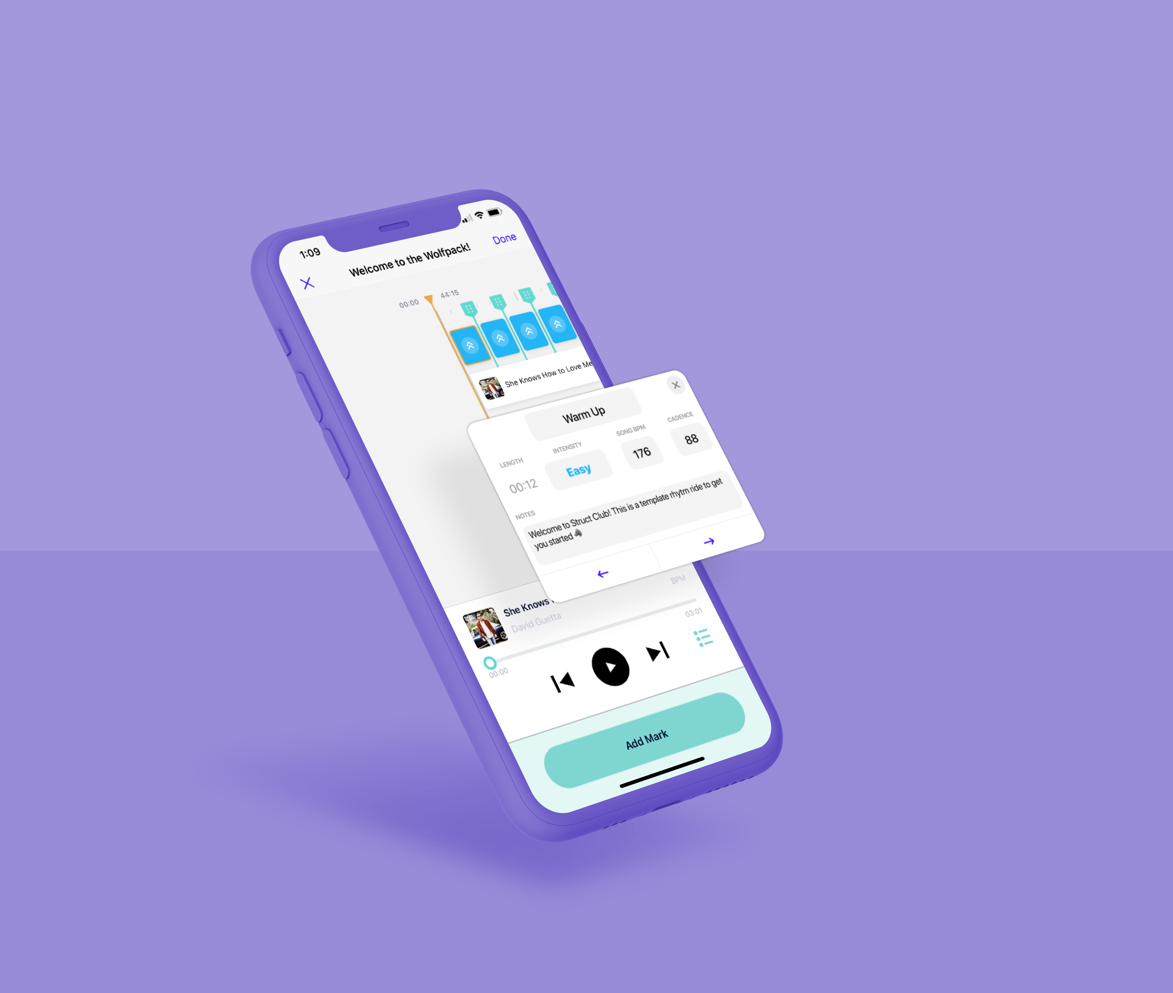
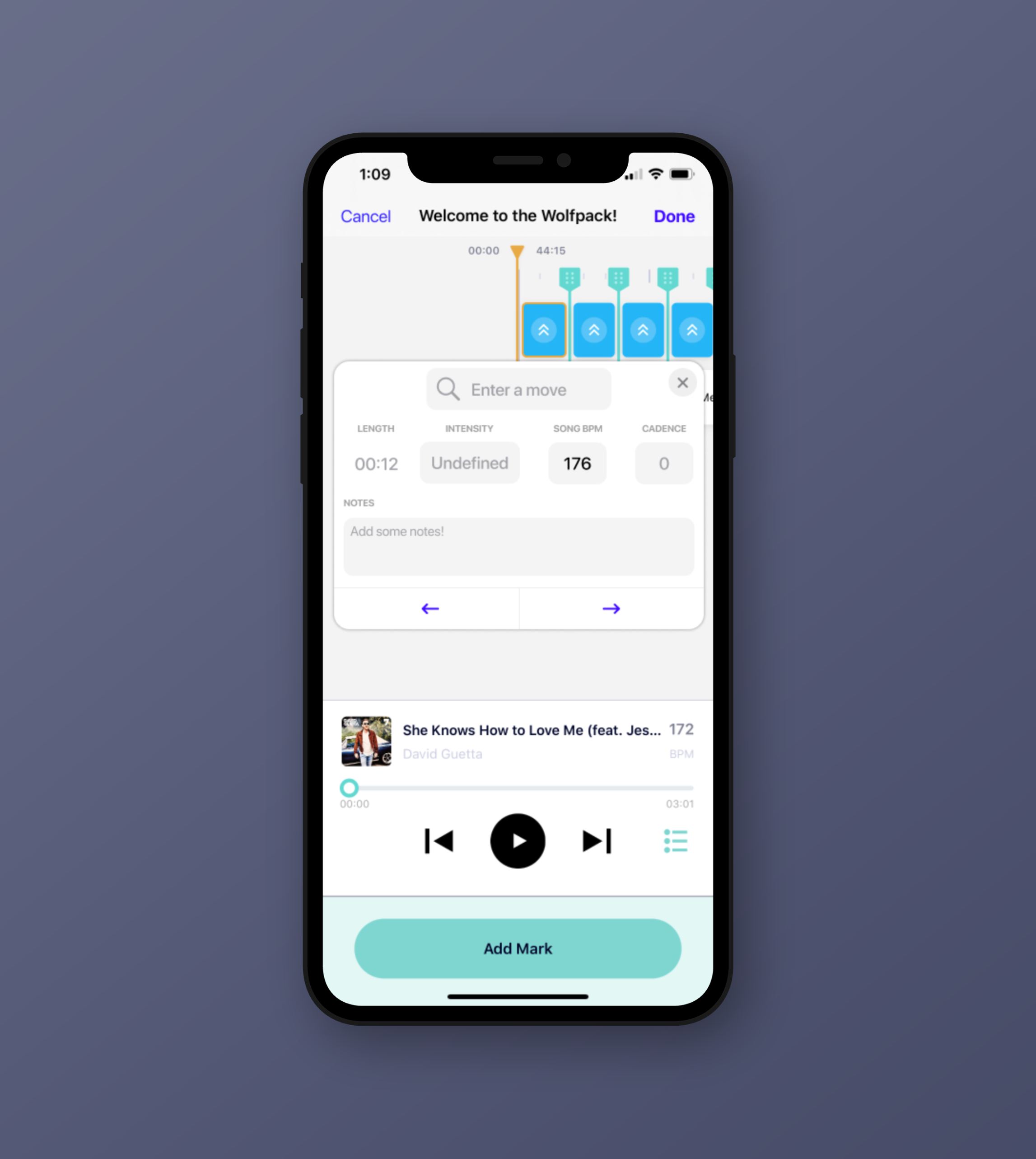
Final Solution: Card Overlays
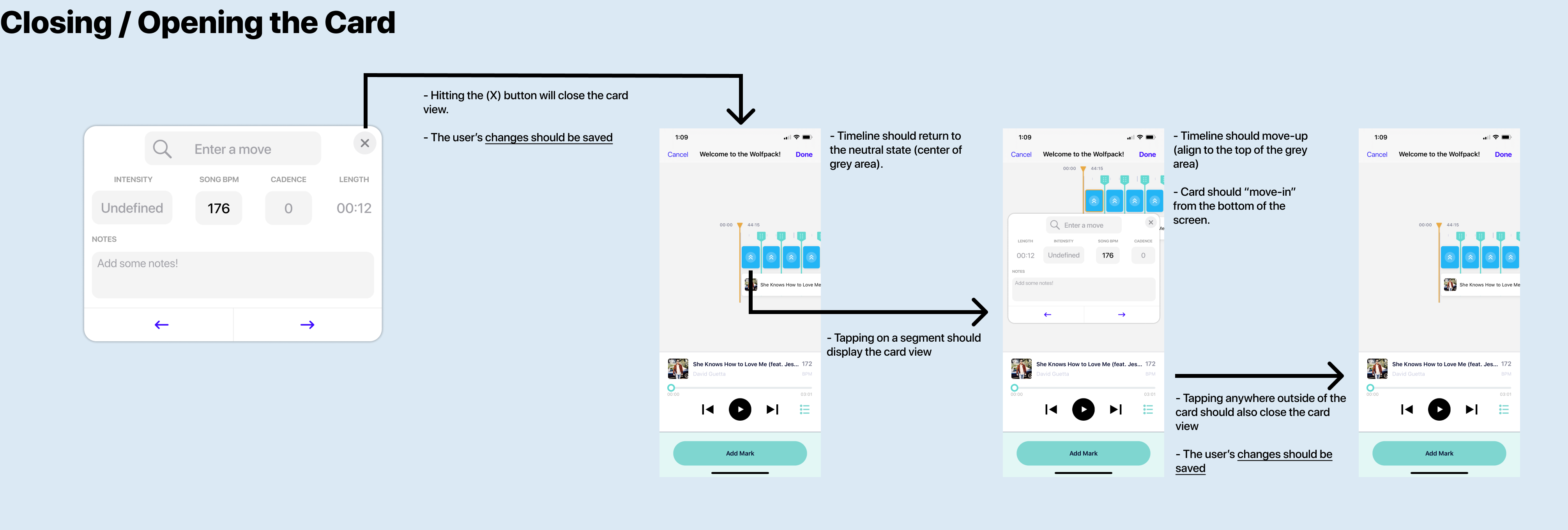
My solution to the users' goals is a card overlay. It lays on top of the current design, but strips out the navigation to new
views and minimizes the number of clicks to accomplish tasks (from 8 to 5).
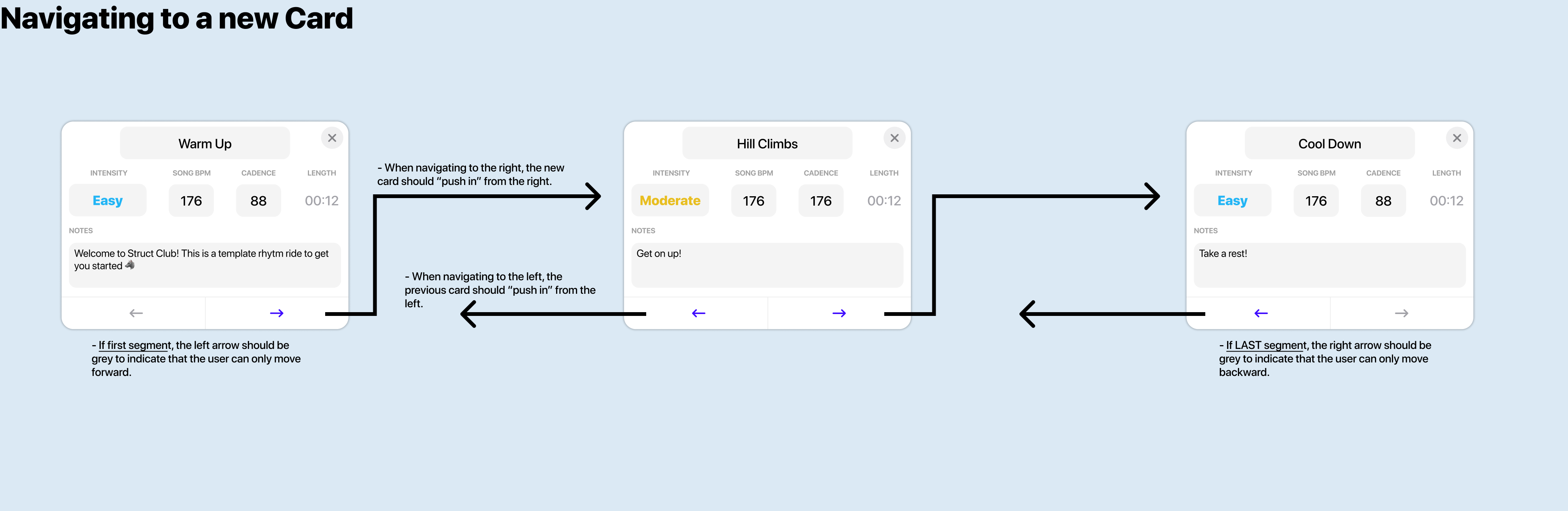
Before, users had to click on each segment and navigate to a new editing view to update the type of move, intensity, and notes. Now, users
can navigate between segments with one tap (purple left & right arrows).
Since the card lays on-top of the timeline view, it enables users to maintain an understanding of their position relative to the entire class.
Now users will be even more accurate in the editing process.
Where did I start?
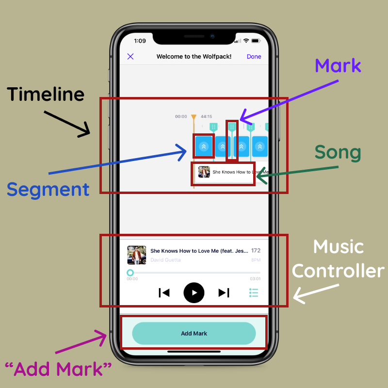
First, let's take a look at the previous version of Edit Mode. There are several visual elements & functionality that need to be addressed to solve our problem.
- Timeline: Users can horizontally scroll across a timeline to view their entire workout.
- Segment: A segment represents a workout move (i.e. Jumping Jacks) with an intensity (indicated by the color).
- Mark: A mark is a draggable element which represents the end/beginning of a new segment.
- Song: Helps users visually see their location within the song.
- Music Controller: All workouts are accompanied by curated playlists from users.
- Add Mark: Users typically listen through playlists & add marks at points of musical transition. This is key to creating fantastic music-inspired workouts.
Not many available solutions
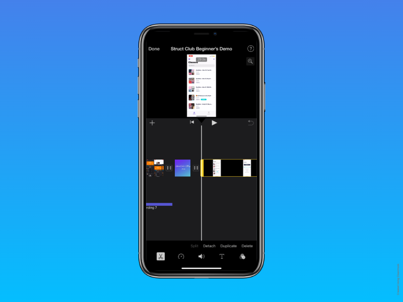
I found that iMovie followed very similar conventions to Struct Club. It utilized a scrollable timeline and presented options at the bottom of the screen. However, iMovie's edit mode had the same pitfalls of Struct Club. The edit process was arduous and I estimated about 8 taps per segment I edited. Google Calendar events (or segments) also required about 6-7 taps per event to change dates, times, recurrences, and color coding. Although, it required less overall time (likely resulting from the nature of events -> they don't happen all at once).
Wireframing & Prototyping
First, I started sketching on paper. Then I met with stakeholders (i.e. my lovely CEO, Amira, and amazing engineer, Eann) to consider business strategy, resource constraints, and feasibility. Next, I begin drafting wireframes & the iteration process followed for the next few weeks. Ultimately, the process completes once all stakeholders feel the design (1) achieves our users' goals and (2) aligns with our overall strategy. Especially in a start-up, it's also important to consider what SMALL changes will have a BIG impact (80% results 20% effort).
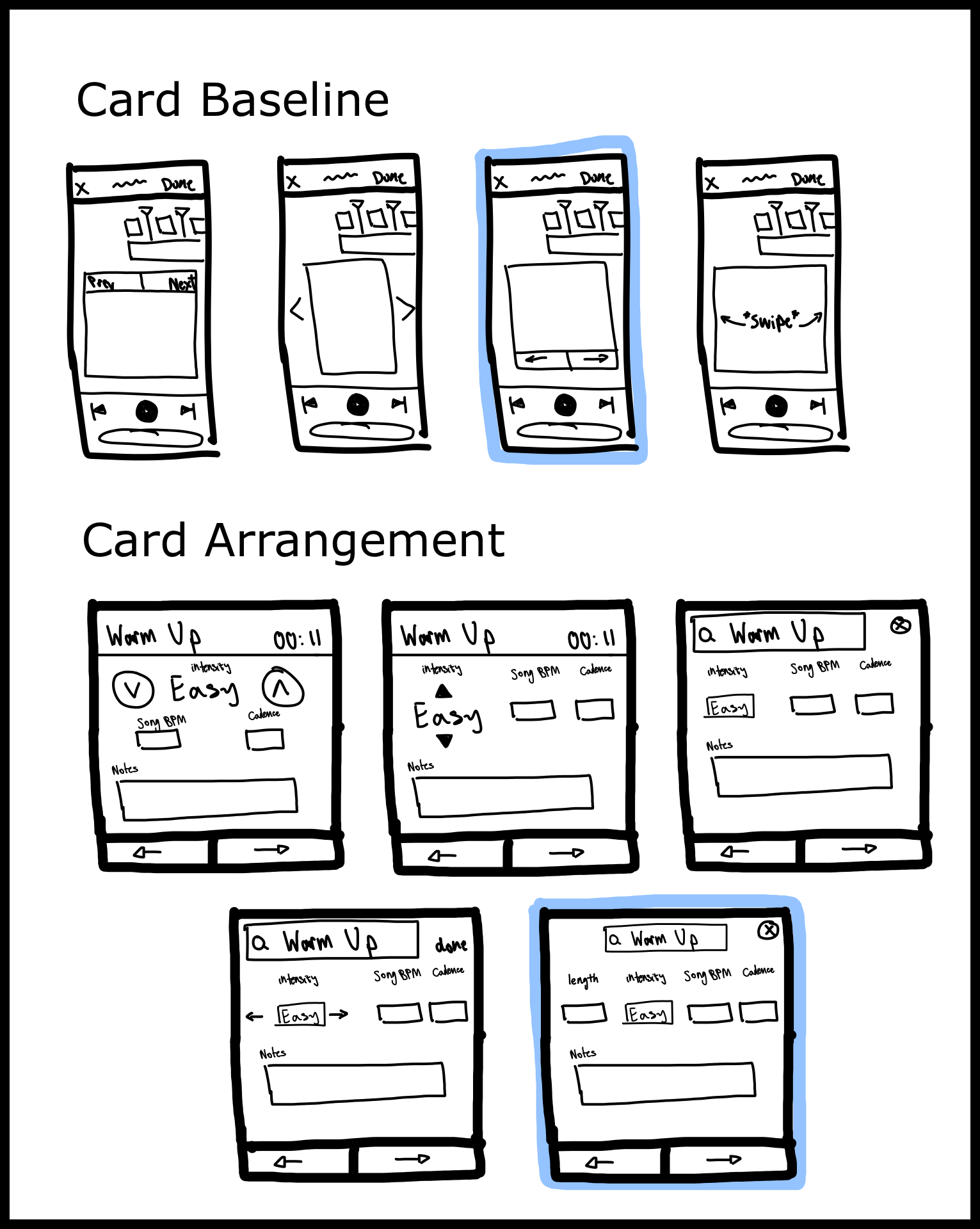
Sketches
Just to reiterate: users told us that the editing process took too long (over 1 hour). So the solution needed to achieve several goals...
- Reduce the overall time spent creating a class
- Reduce the number of steps to edit a single move
- Maintain accuracy to the second
My solution draws inspiration from Apple Music song overlays (or "cards"). The cards have key advantages that could help streamline the edit process...
- Contains only the most important information & buttons for the segment
- Hides all unnecessary functionality below it
- Allows for quick navigation between segments (or songs)
On the right, I outline some of my ideas for "cards" of segments. The highlighted blue indicates the chosen design by stakeholders.
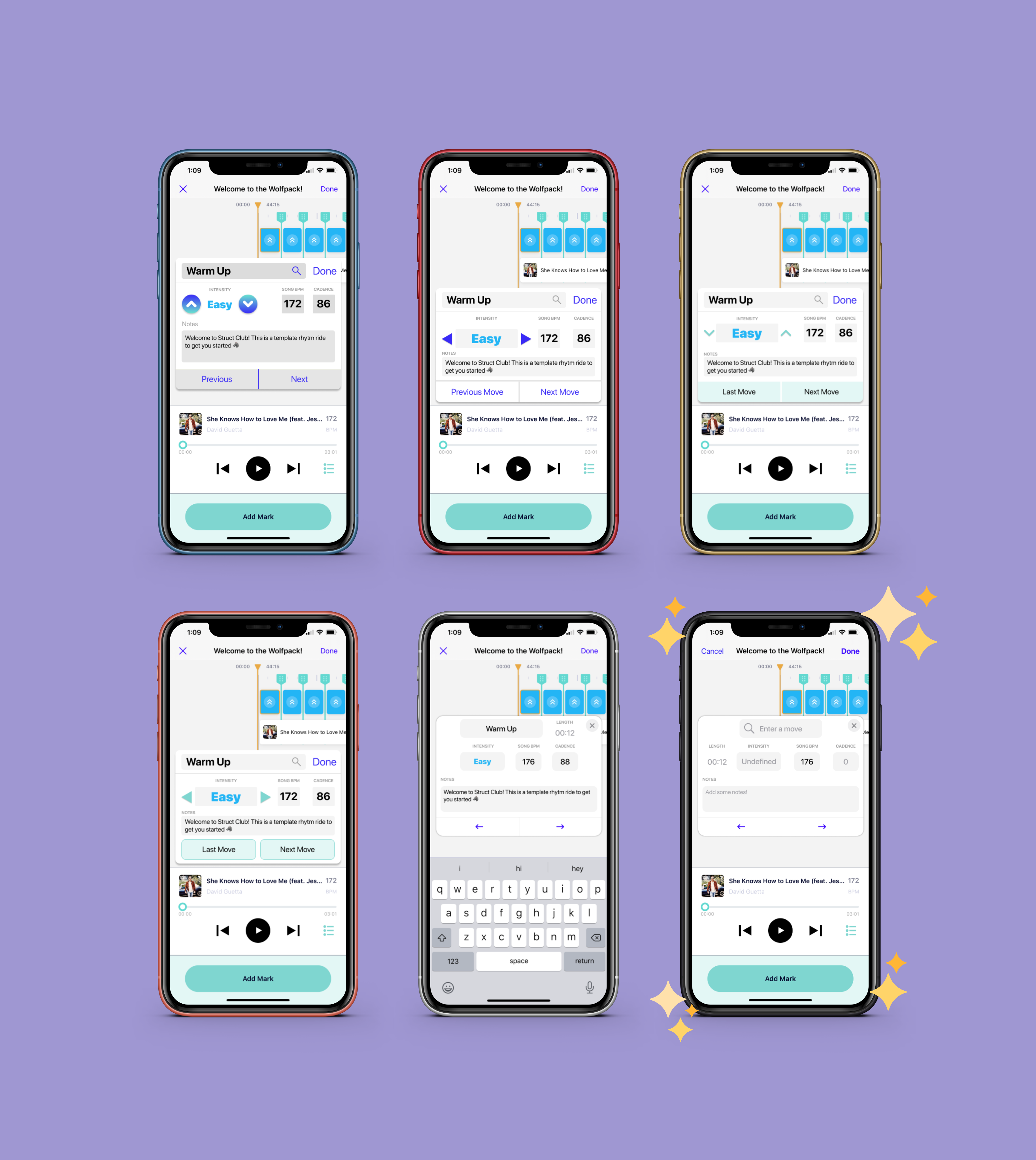
Drafts
After producing low-fidelity wireframes, I moved onto mid-to-high fidelity wireframing in Figma. I produced a number of draft frames, but these are the highlights! At every step in the design process, it's important to reevaluate whether or not the solutions create value for users.
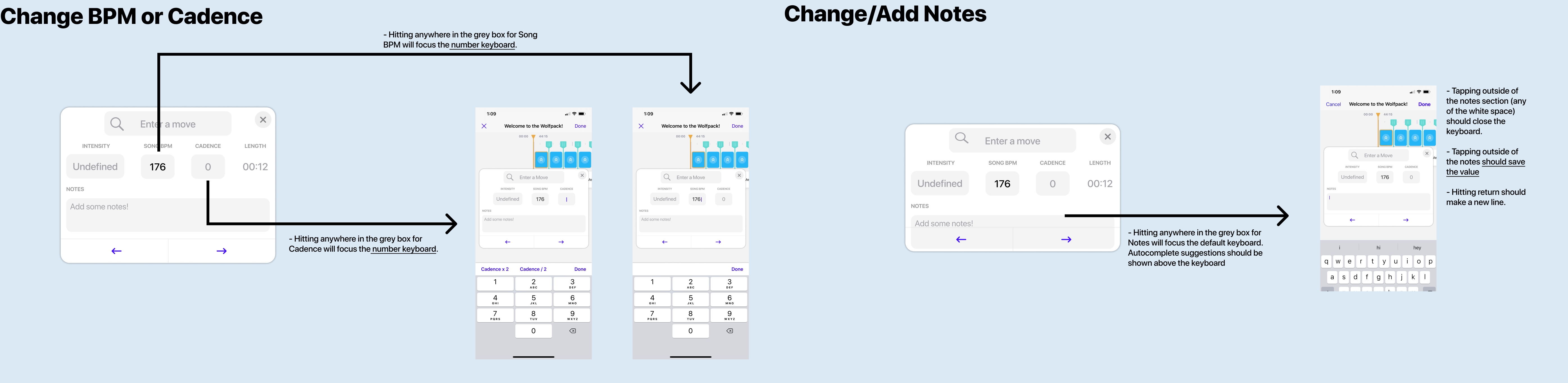
How do cards help users achieve their goals?
- Reduces the number of steps to edit a SINGLE segment from 8 to 5 (no navigation to new screen)
- Reduces the number of steps to navigate to a NEW segment from 3 to 1 (left & right arrows)
- Maintains editing accuracy to the second (timeline intact)
SPOILER: The chosen design has sparkles around it!
Final Version!
Now users can happily create workouts with ease. Navigating quickly from one segment to another, user will be able to spend more time curating workouts and less time hassling between views. The edit process for a single segment also now requires 3 less steps, so users will spend even less time per segment.
Number of steps decreased from 11 to 6...
The final version presents an elegant visual hierarchy, aligns with the Struct Club's design system, and helps users achieve their goals.
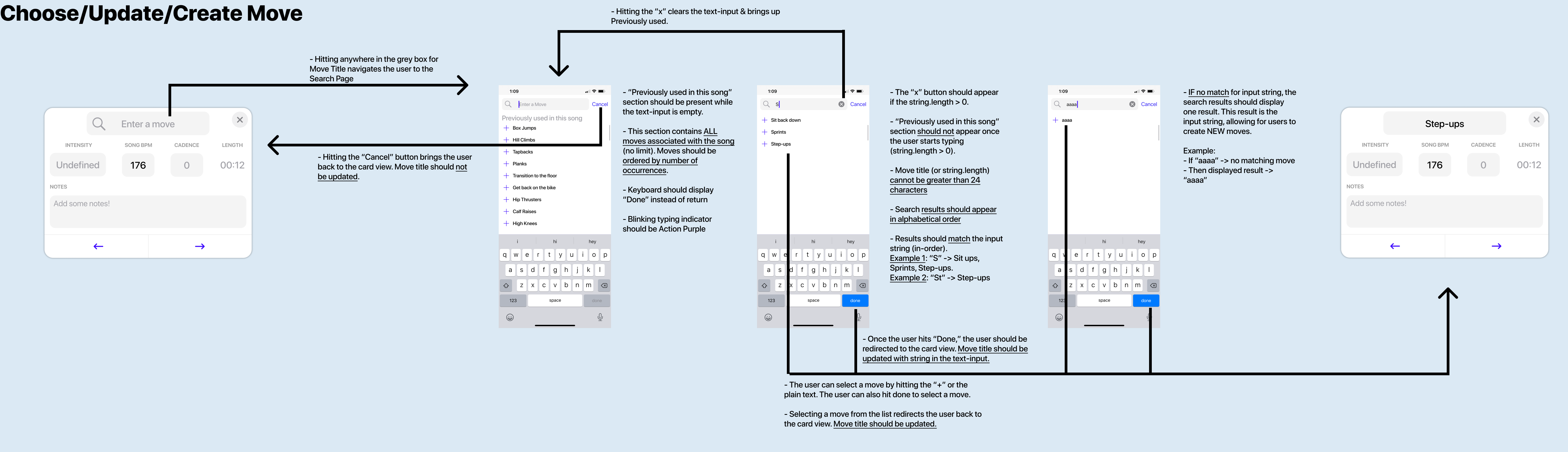
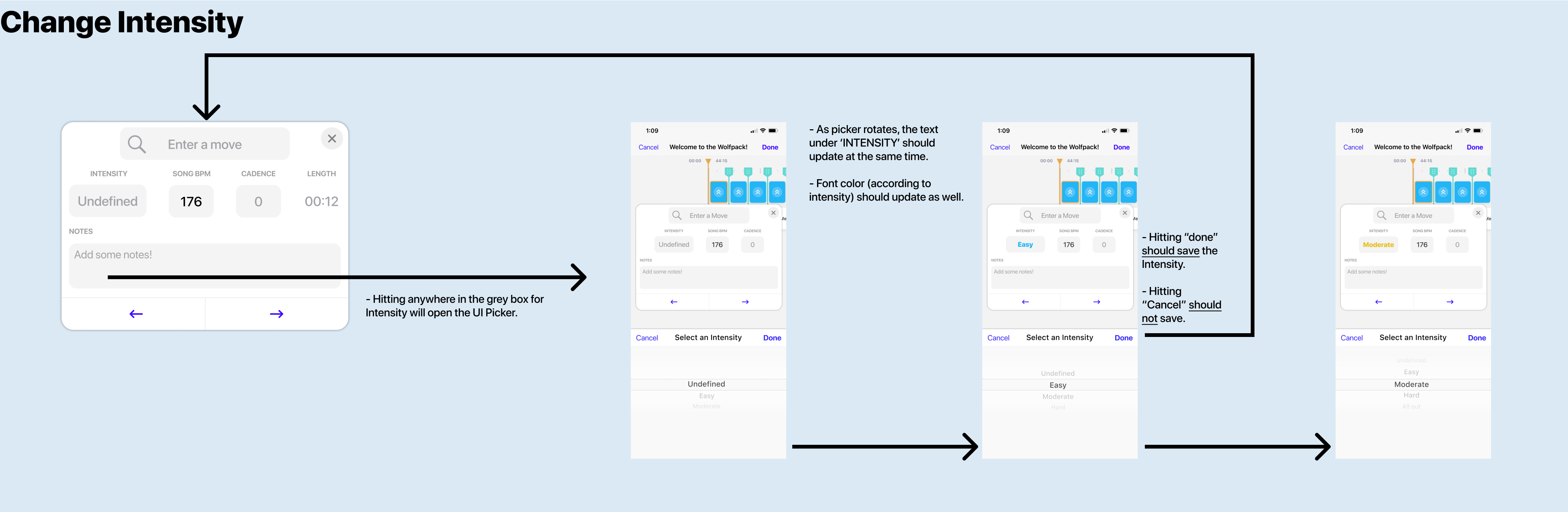
Engineering Hand-off
Check out the all the re-designed functionality for Edit Mode Cards!
Reflection
Edit Mode Cards tested my design skills more than any other project that summer. I struggled not only in juggling other projects in Marketing and Quality Assurance, but also in developing my own processes as a ONE-PERSON UX team. I had to learn quickly and develop standards for my work which didn't exist. I guess that's the beauty of start-ups. I also felt some pressure to not screw everything up! Edit Mode is a core feature set for Struct Club. In the end, I can confidently say I've learned a lot about myself and developing design processes:
- Spend enough time with simple sketches before wireframes: I fell into the trap of moving too quickly to high-fidelity, and I ended up creating a lot of work for myself. I spent too much time trying to make everything pixel perfect when I wasn't even sure it was the solution.
- Don't spend so much time prototyping everything for drafts: This is another time-saving tip. I spent waaay too much time creating fancy animations in Figma. Part of me really enjoyed working with the tool, but it ended up causing me stress closer to the deadline.
- Take extensive notes & ask tons of questions in stakeholder meetings: Stakeholders have many of strong opinions (especially when your stakeholder is the CEO). Their time is also very limited. In initial meetings, I found myself taking her opinions at face value and then not quite reaching her expectations. Non-designers do not speak in design terms, so it's imperative that you get a clear understanding of their suggestions.
- Believe in your ideas and avoid impostor syndrome: A common pitfall, especially in young designers, is to doubt your own ideas. Early in the project, impostor syndrome affected my ability to present confidently and demonstrate my skills to my boss. I learned to deal with it by reaching out to the extremely supportive design community. Learning about others' experiences helped me remove my ego from my designs and become a better listener.

I wish I had time to...
- Validate my design: I wish I had time to test my assumptions. This project came at the second half of my internship, so I did not get a chance to see if my assumptions were true.
- Be a part of the development: I wish I had time to develop my designs in Swift. It's a super gratifying feeling to bring your creations to "life!" Best of luck to my colleague!
Check out my other projects

USC American Lung Association
I designed and developed USC American Lung Association's new website.
Read More
Struct Club: Summer Collection
I designed the first bundle in Struct Club's fitness class marketplace.
Read More