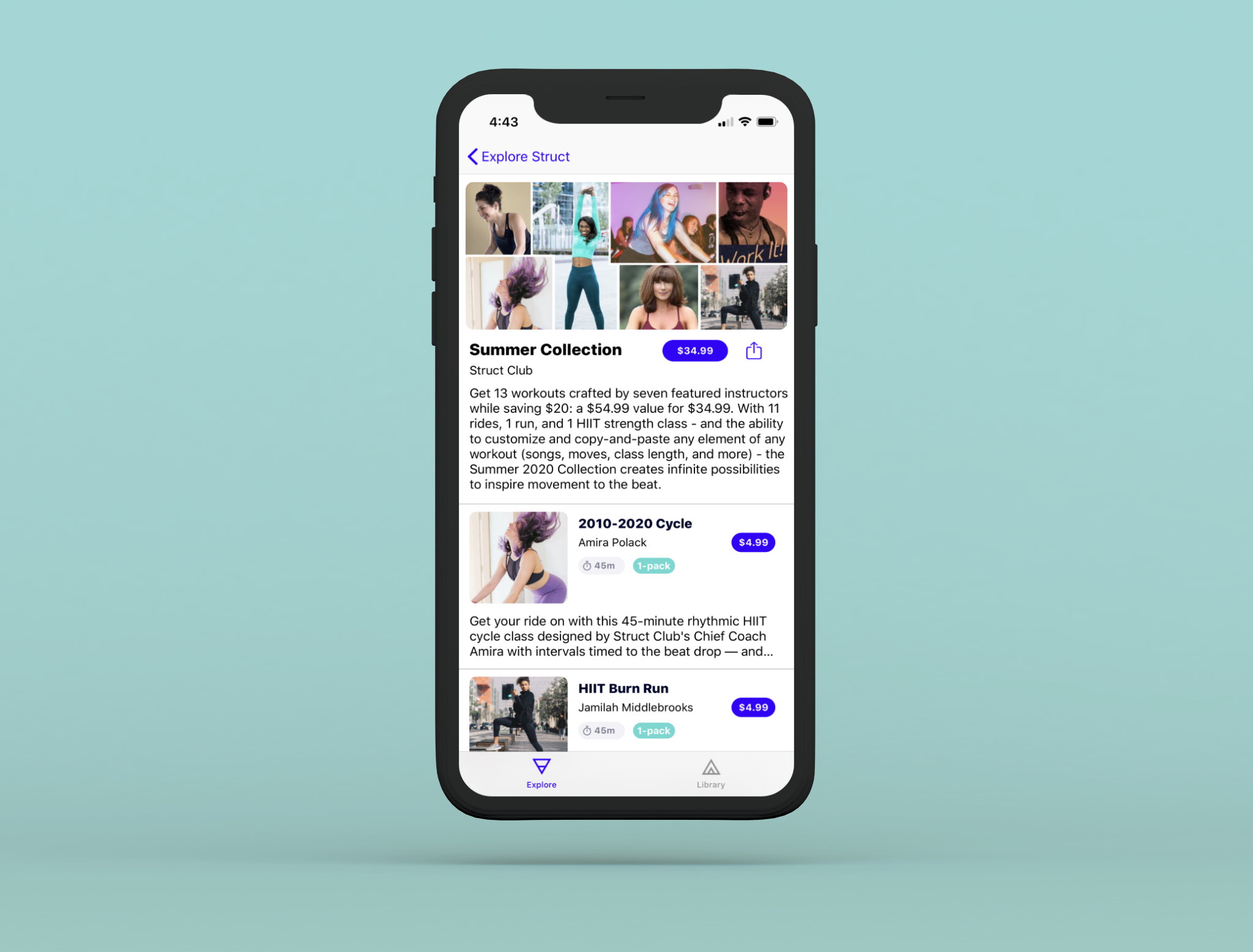
Struct Club: Summer Collection
Let's bundle them!
Struct Club is a creator platform for fitness instructors to create music-inspired classes. The "Summer Collection" is Struct Club's very first workout-class bundle, containing 13 workouts created by featured fitness instructors. These 13 classes were sold separately before and would need to be elegantly packaged together and remain in the confines of Struct Club's design system.
Elegantly arranging...
Per the client's requests, the design needed to achieve several goals:
- Preview each of the classes in the bundle
- Convince & prompt users to buy the bundle
- Allow users to purchase individual classes as well
- Maintain consistency with existing design systems
Adding to the design system...
Since there were already existing designs for classes, I took a look the current designs and I asked myself: "how is the visual hierarchy arranged?" and "how can I improve upon this baseline?"
Incorporating elements from existing designs
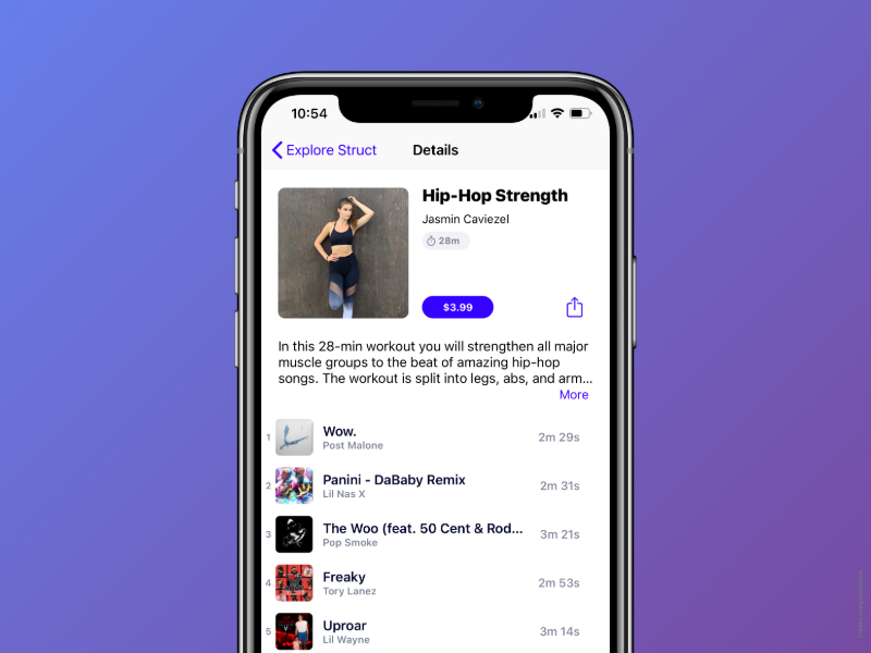
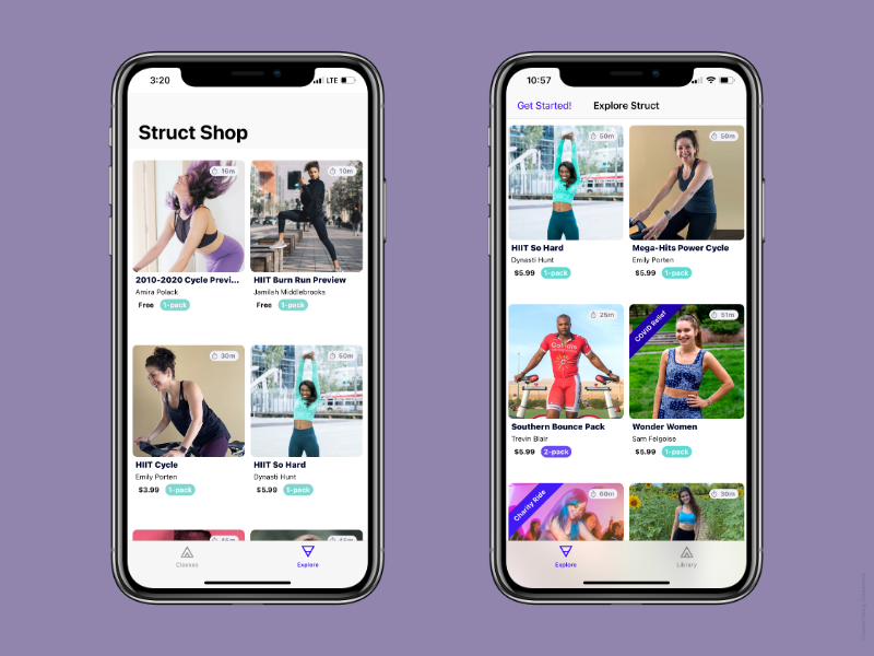
Since one of my goals was to maintain consistency with existing design systems, I spent a lot of time analyzing the informational hierarchy and color choice of a single class page (which is visible on the left). Some key elements of a class to note:
- Each class has a title, author, and duration
- The purchasing button has high contrast and contained the price inside it
- Class descriptions are only previews
- Each class was sharable (I was actually the designer who recommended this change!)
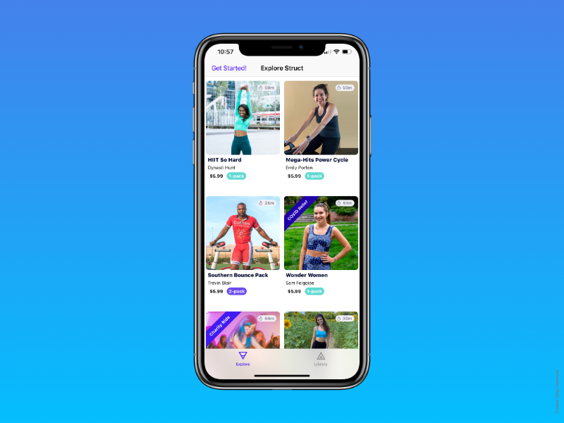
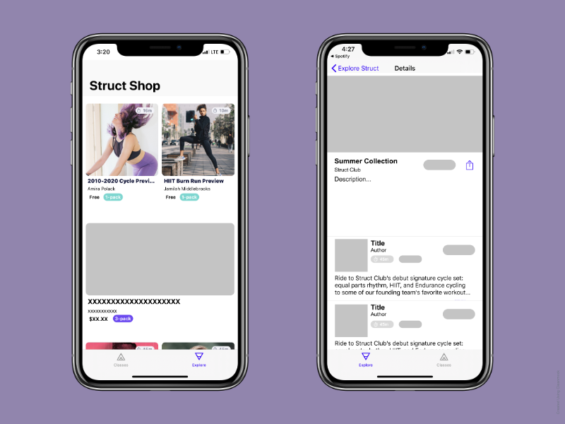
Differentiating from the existing designs
Something that each class also had were the songs associated with the class. However I believed that with 13 classes, displaying all the songs for each class would overload the user with too much information. That would be around 104 songs (13 classes * 8 songs per class), and create a huge vertical scroll. In turn, I decided to ...
- Remove the song previews from my design
- Incorporate large cover photos (that you see on the left)
- Differentiate the bundle page with a banner image
Wireframing & Prototyping
The first step of Wireframing (in my design process) is sketching on paper. Then I meet with stakeholders (i.e. my lovely CEO, Amira, and amazing engineer, Eann) to consider business strategy, resource constraints, and feasibility. Next, I begin drafting low-fidelity wireframes & the iteration process follows for the next few weeks. Ultimately, the process completes once all stakeholders feel the design (1) achieves our users' goals and (2) aligns with our overall strategy. Especially in a start-up, it's also important to consider what SMALL changes will have a BIG impact (80% results 20% effort).
What screens do I need?
Before embarking on a project, it's important to take inventory of essential deliverables. In this case, there are two key screens I would have to design and prototype.
- Cover image on Explore Page: All classes for purchase reside on the Struct Explore Page. I would need to develop a cover image or banner that would live on the Explore Page (i.e. a shop item).
- The bundle page itself: Like a single class page, I would need to create a page for the the bundle item itself and present its contents in an easily digestible format.
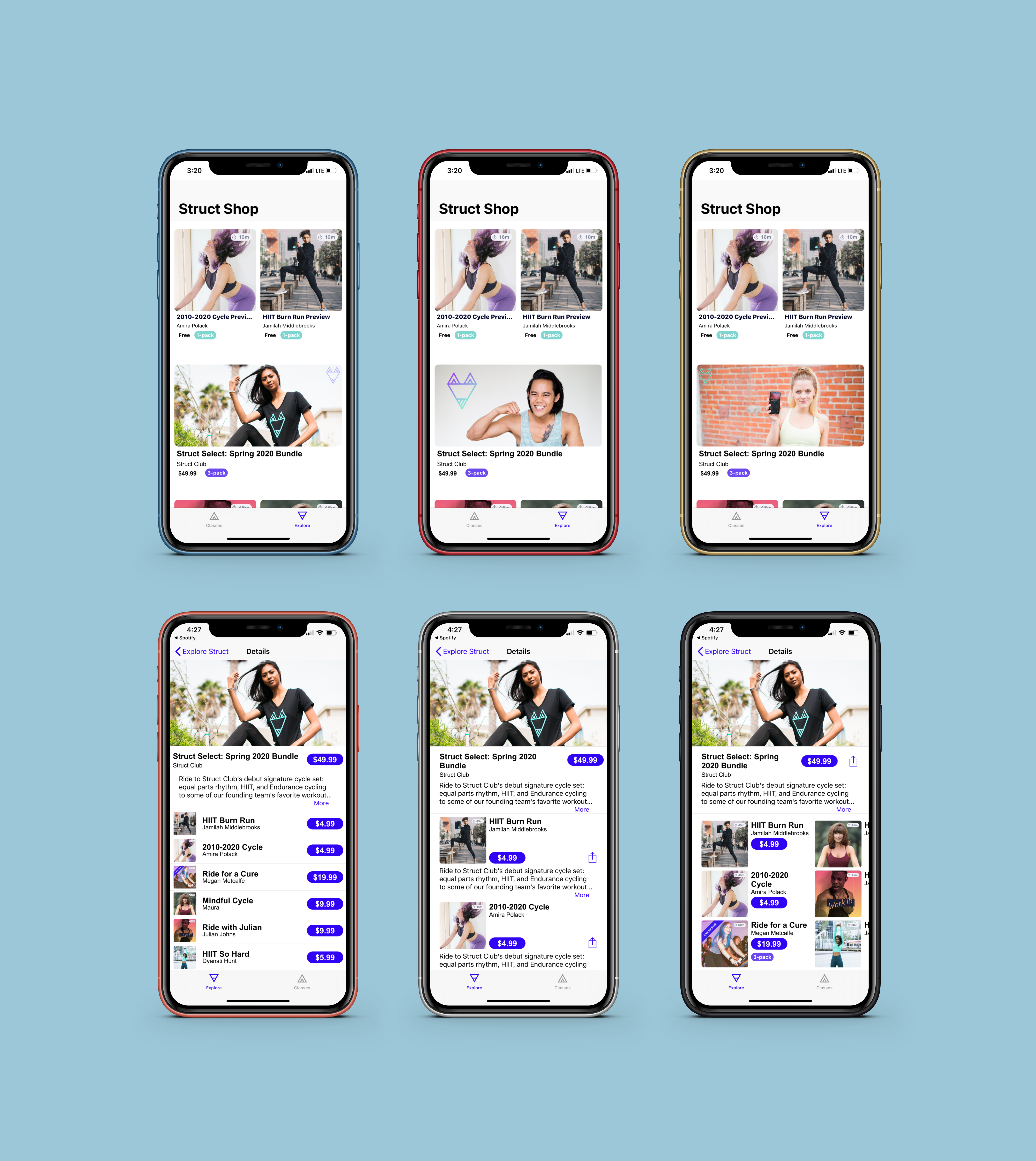
Low Fidelity
This solution has three main advantages...
- Visually differentiates the bundle from singles in Explore Page
- Banner image differentiates the bundle from a single class page
- Still maintains consistency to current design system
Mid-Fidelity Drafts
After producing low fidelity wireframes, I moved onto mid-to-high fidelity wireframing in Figma. I produced a number of draft frames, but these are the highlights! At every step in the design process, it's important to reevaluate whether or not the solutions create value for users. Sometimes, I can walk myself into the "wouldn't it be cool if" conversation without considering my users' goals.
How do cards help users achieve their goals?
- Make it easy to purchase the entire bundle (as well as singles)
- Show the user the contents of the bundle without overwhelming them
- Maintain consistency with existing design systems so there's no learning curve
Now that the design aligns with user goals, I met with my stakeholders to determine which iteration would help users best achieve their goals.
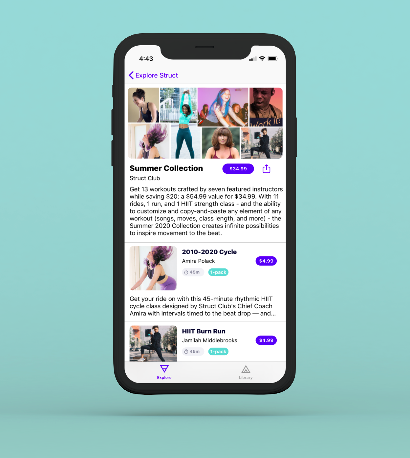
Final Version
The final version of the my design...
- Preview each of the classes in the bundle
- Convince & prompt users to buy the bundle
- Allow users to purchase individual classes as well
- Maintain consistency with existing design systems
The Summer Collection differentiates itself from singles, but still follows the same visual constraints of singles.
The final version presents an elegant visual hierarchy, aligns with the Struct Club's design system, and helps users achieve their goals.

Cover Image
This is my design for the cover image. However, the final design did not include this cover image. One of our Strategic Marketing folks created a cover image we all thought fit the bundle much better! Nevertheless, I wanted to showchase my work.
Reflection
The 2020 Summer Collection was my first UX Design project at Struct Club. I learned a lot about myself and my design process through this project...
- Being a leader on a small team:
At a startup, you have to be able to lead on your own. While I was just an intern, there were only 5 team members. I had an amazing opportunity to hone my leadership skills as the ONLY person on the design team. I had to defend my designs, advocate for the user, and provide solutions when called upon. It was a lot of pressure at first, but I earned my stars by staying focused and providing valuable solutions.
- Find others who can help you:
As you read above, my design for the cover image did not make it into the final version. To some this may seem like a bummer, but it was really a blessing in disguise! As someone who comes from a technical background, I struggle with graphic designs. My co-worker's design filled a gap in my own skill-set and helped me present a more elegant final draft to my boss. I learned to lean on those around me in this project, and I'm so glad I did!
- Believe in your ideas and avoid impostor syndrome:
A common pitfall, especially in young designers, is to doubt your own ideas. Early in the project, impostor syndrome affected my ability to present confidently and demonstrate my skills to my boss. I learned to deal with it by reaching out to the extremely supportive online design community. Learning about others' experiences helped me remove my ego from my designs and become a better listener.
I wish I had time to...
- Validate my design: I wish I had time to test my assumptions. Development for this design was delayed until after my internship, so I did not get a chance to see if my assumptions were true.
- Be a part of the development: I wish I had time to develop my designs in Swift. It's a super gratifying feeling to bring your creations to "life!"
Learn more about Struct Club: https://structclub.squarespace.com/
Check out my other projects
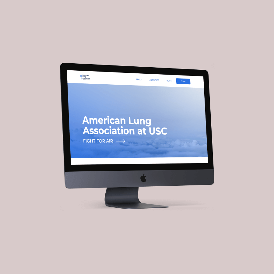
USC American Lung Association
I designed and developed USC American Lung Association's new website.
Read More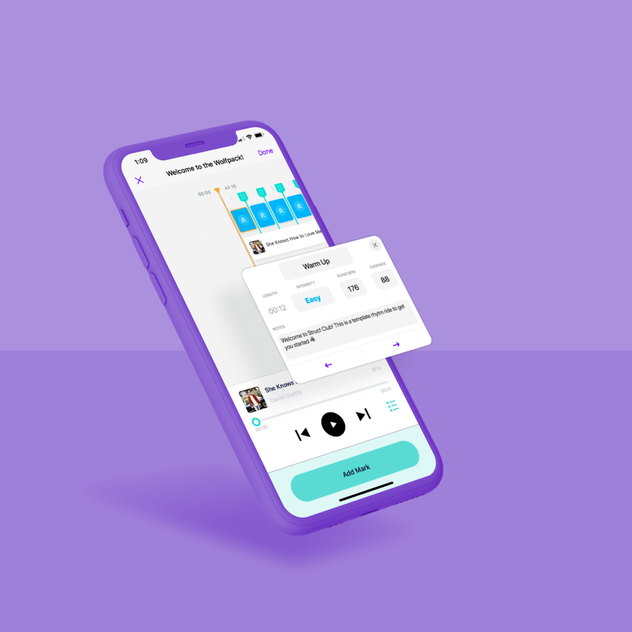
Struct Club: Edit-Mode
I redesigned a fitness class editing tool for the music-inspired fitness app, Struct Club.
Read More